Timeline: about 7 months (September 18, 2023 to April 8, 2024)
Topic: Real Estate
Number of team members: 8
My role: user research, information architecture, creating storyboards and wireframes, designing the prototype in Figma, usability testing
Timeline: about 7 months (September 18, 2023 to April 8, 2024)
Topic: Real Estate
Number of team members: 8
My role: user research, information architecture, creating storyboards and wireframes, designing the prototype in Figma, usability testing
Searching for a home by using real estate websites is a highly visual process, but most real estate websites have little to no accessibility features to help individuals who are visually impaired find homes. For this project, my team worked with the Director of Experience Design at Rocket Homes, a real estate company with its own website and app, to find out how to improve the accessibility of their digital products. We decided to focus on users who have a visual impairment due to the lack of accessibility, not just in the digital products of Rocket Homes but in many other popular real estate websites as well.
To understand this problem better, my team performed a competitive analysis of Rocket Homes and other real estate websites such as Zillow, Remax, Realtor, Redfin, Trulia, and Homes.com. We took notes on the experience of using these websites with a screen reader and keyboard to navigate the page, as this is how many users with visual impairments navigate websites. Since they have limited to no vision, they use a keyboard to move around a page instead of a mouse or trackpad.
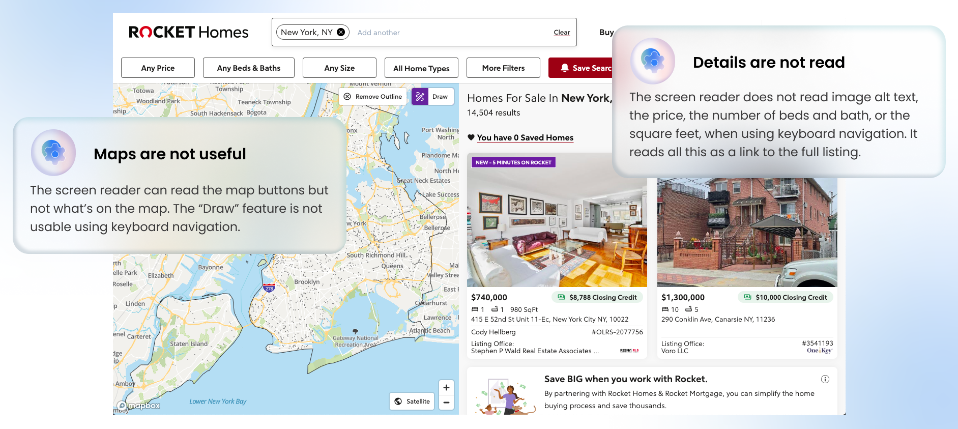
All these websites had significant problems with being fully accessible when using a screen reader. Many important details of the home were undetectable using keyboard navigation. For example, on Rocket Homes, after completing a search for a home in a specific location, an interactive map and a list of homes appears. However, the screen reader can only detect the buttons on the map's interface and not the locations on the map, making the map feature unusable for screen reader users. For the list of homes, the details about a home’s price, number of bedrooms and bathrooms, and number of square feet are undetectable when using a keyboard and screen reader to navigate the page. Instead, due to the coding of the website, these details are read as a link leading to the page with the listing's full details. This makes the home search process even more time-consuming and difficult as the user must select each listing's link to find this essential information on a new page instead of finding it directly on the search results page.
With this problem in mind, our team set this as our goal: How might we design an experience that helps the visually impaired and totally blind learn about homes on the market?
My team kept our design goal open at first to “an experience” as we were not sure if a website, app, or some other format was the best way to share information about homes to users who have a visual impairment.
Our client also expressed that he did not want us to make changes to the current version of Rocket Homes. Instead, he wanted us to design a new product from the ground up, specifically designed for accessibility.
Through personal connections, my team was able to find eight people who had a visual impairment, ranging from partial blindness to complete blindness. For the first round of interviews, we interviewed each person individually and asked them questions that were related to their experience with finding homes and their experience with using their technological devices.
In order to understand our target users’ process when searching for a home, our team completed interviews to identify
For the second round of interviews, we created task-based questions to help our research participants follow a general sequence of activities that they would need to complete when searching for a home on a website. This sequence of activities was based on the response of participants from the first round of interviews when they were asked about their process of searching for homes. Through this round of interviews, we focused on learning about what content users expected to encounter for each step of the process and their desired order of content on a web page from the top to the bottom of the page.
The following points are the main takeaways from our user research:
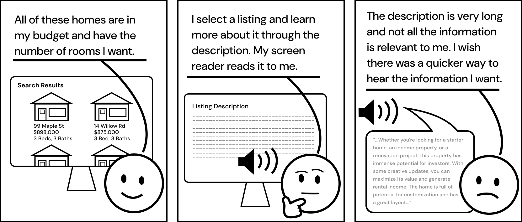
If someone can see the images on a real estate website, they’re most likely using the images on the Search Results page to help them browse the many options and to help them decide if a listing is worth selecting and further exploring. However, for our target users who are not able to see these images, they expressed in our interviews how it’s very difficult to browse the many options on the Search Results page and determine which listings are worth their time to further explore, when the Search Results Page only provides basic information about each listing.
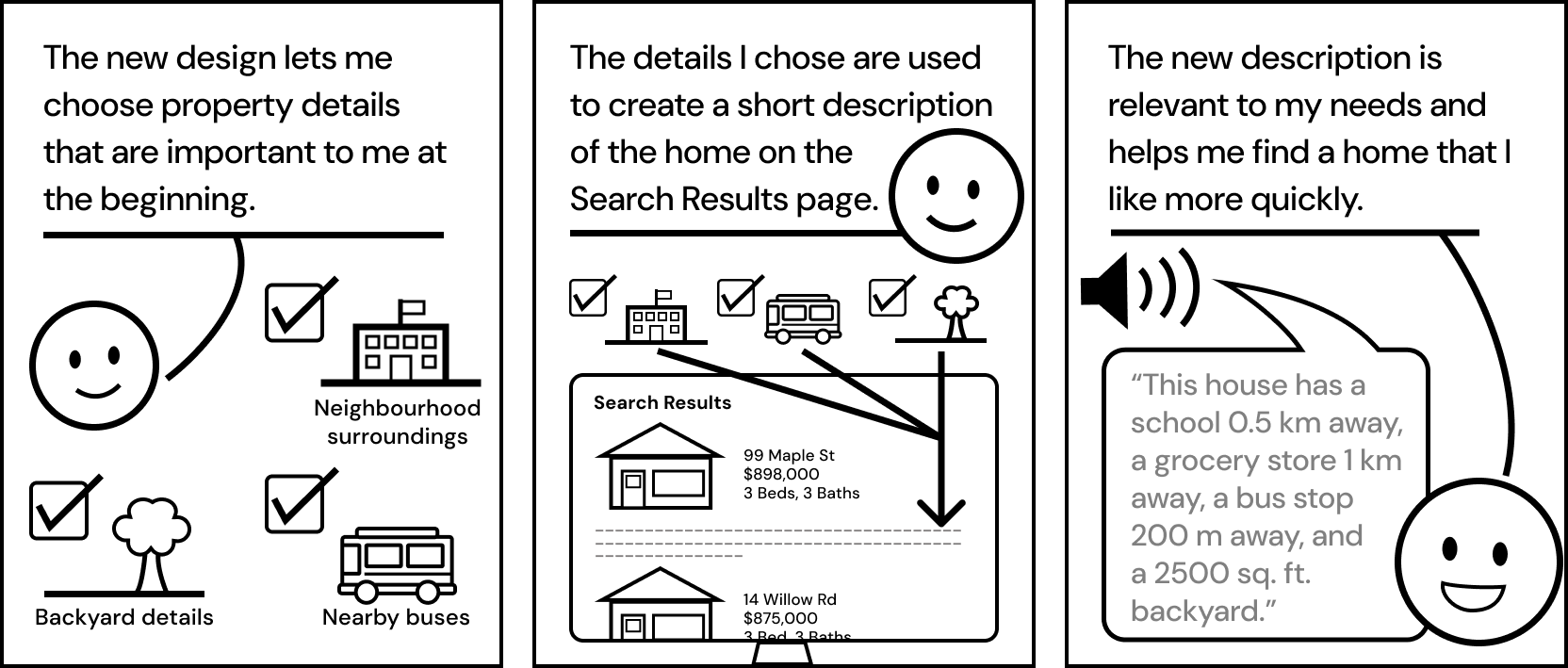
Based on our research findings, our newly designed website had to
After finalizing an idea for our first prototype using the preferences and patterns discovered in our research, my team created an information architecture structure for the website, a user flow, and basic wireframes. Creating these supported my team and I in building our first prototype in Figma and Webflow.
For our first prototype, we focused more on the layout and information architecture of the website and decided to work more on the visual design at a later stage. Although many of our target users would not be able to see the visual design of the website, we learned from our interviews that many people with visual impairments often use real estate tools with someone who is sighted like their partner or a real estate agent, so visual design is still important.
Due to the requirements of needing code so that a screen reader can use the code to determine what to read, we had to create two prototypes. Through Figma, we created the visual design of the prototype, since it is much easier to do visual design iterations in Figma. Using Webflow, our prototype was able to have code that a screen reader could use, so we used Webflow to test how screen reader users would navigate our prototype. The following prototype images are from the Figma version, as the visuals of the Webflow version were kept minimal.
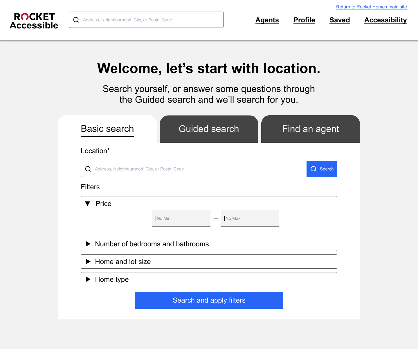
We made three versions of search to support three different search scenarios: a basic search, a guided search, and searching for an agent. Based on our testing, since users wanted their search filters to be on the same page as where they enter their search, the Basic Search option has a search bar where they can type in a location and then add the filters of their choice. The filter options in Basic Search were limited to what our research participants said were the most essential filters.
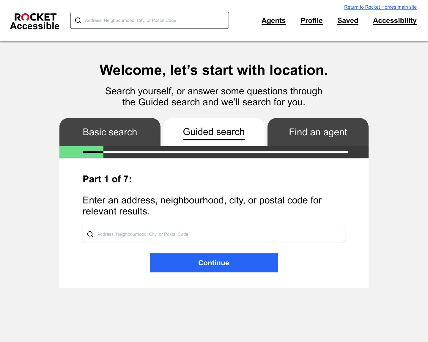
For the second search option, since we gained feedback that the organization of filters on existing real estate websites made it difficult to navigate through using screen readers, we prototyped the guided search to break up the filtering process into small steps. We learned through our testing that simplicity of the content on a page makes it easier to navigate using a screen reader, so our reason for this design decision was that if there was only one question in the box each time, this would make the page more simple and therefore easier to navigate. Since the process was broken down into smaller steps, we were able to put more filter options in the Guided Search compared to the Basic Search, without making the page feel overwhelming.
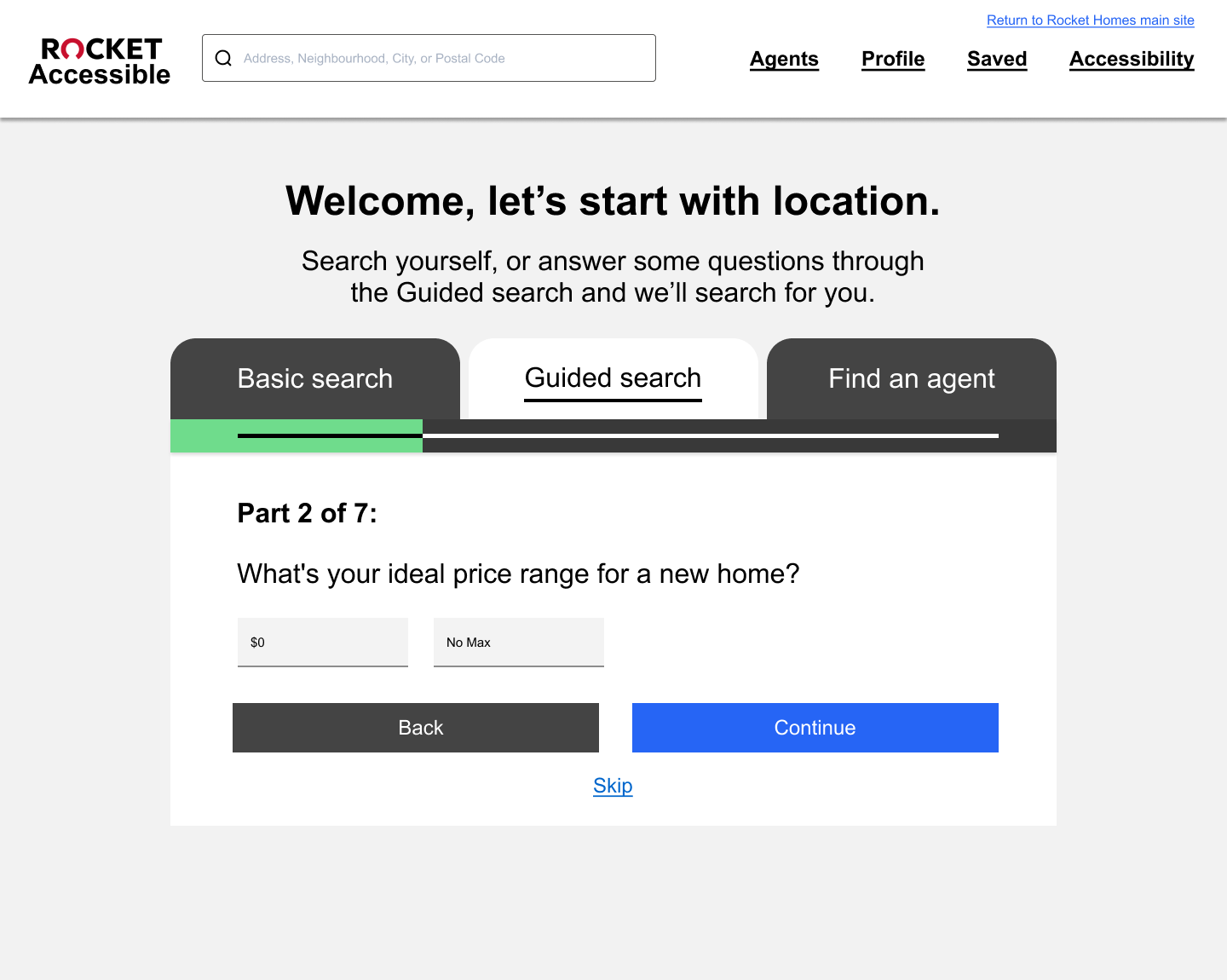
The third option is to find an agent. We learned from our initial interviews that many of our users value their relationship with their real estate agent so we put this on the homepage due to its importance. Although this option to search for real estate agents in our prototype received positive feedback during testing, this feature was later removed due to the business goals of our client Rocket Homes. When sharing our prototype and testing results with Rocket Homes, they said that Rocket Homes finds the user a real estate agent instead of the user choosing the agent themselves. The ability for the user to choose their own real estate agent is not one they are considering currently.
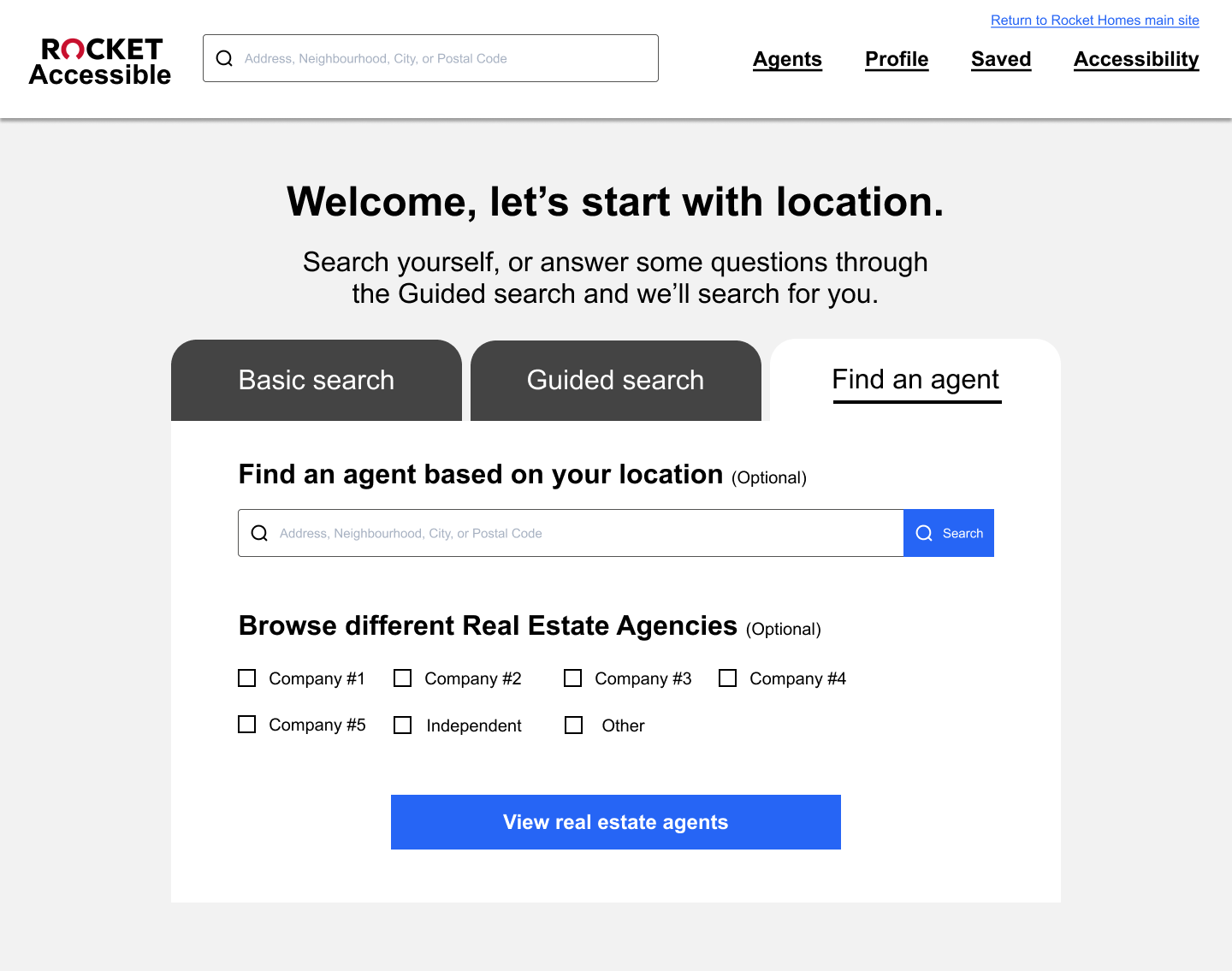
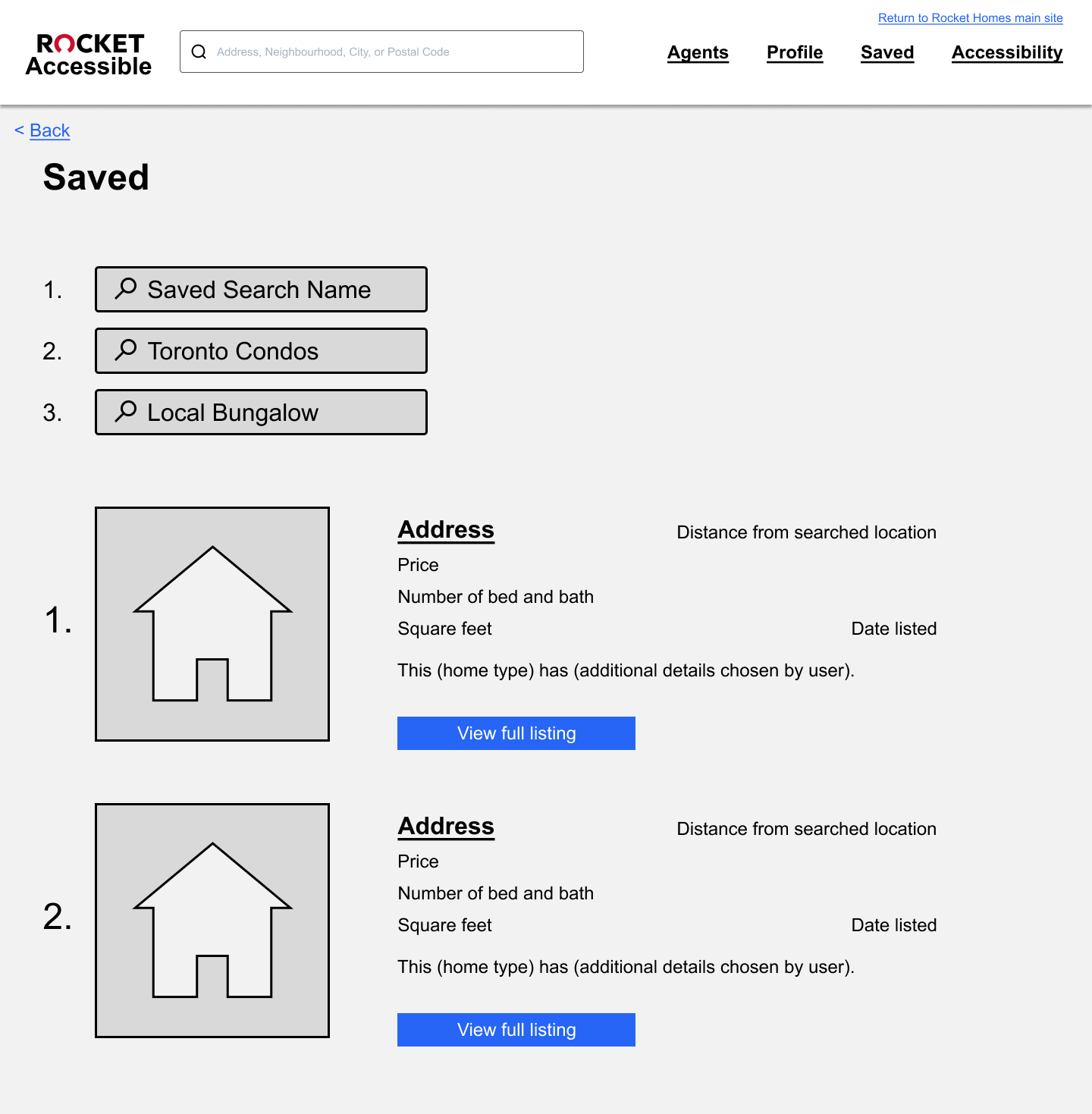
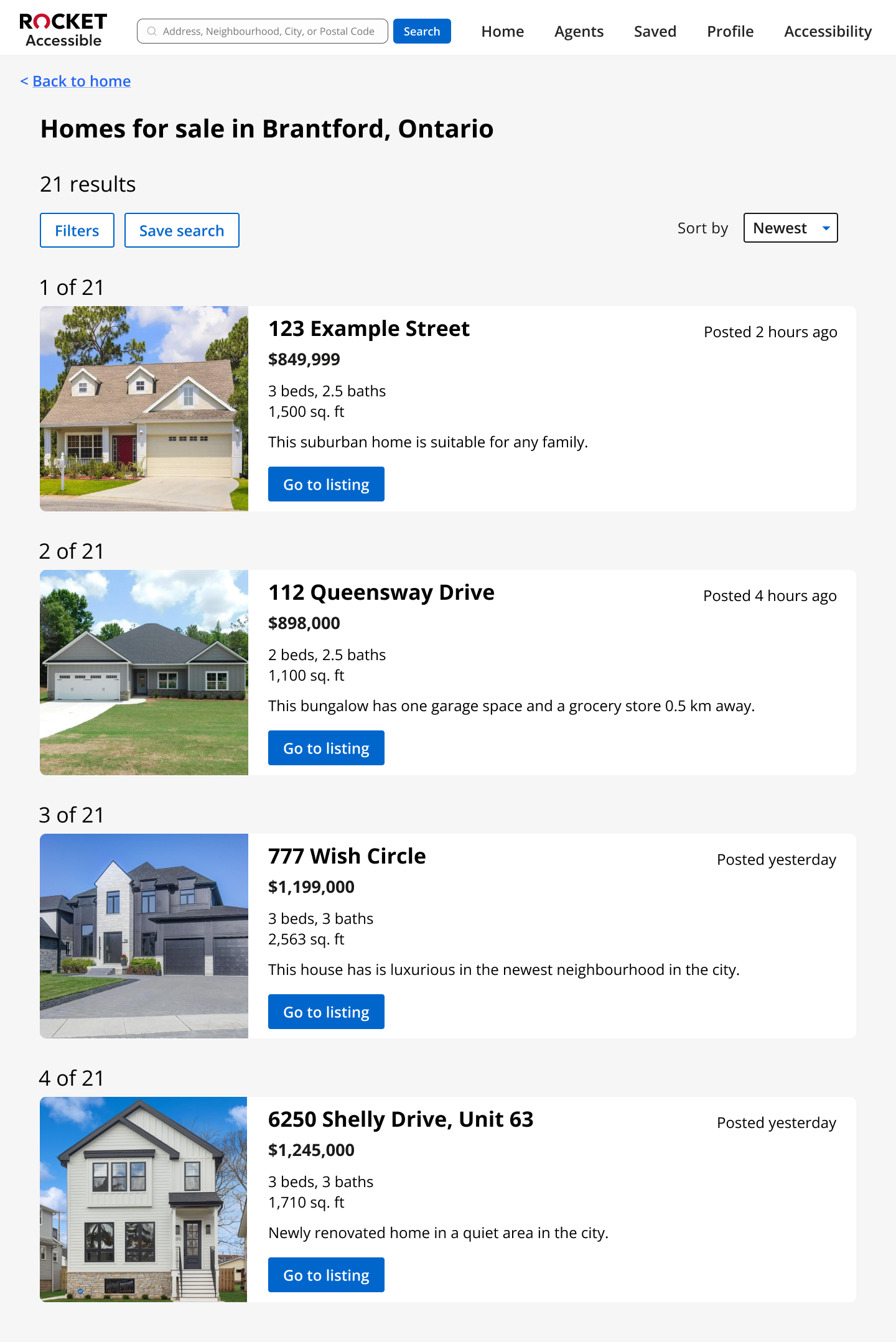
Next, the Search Results page is where users will be brought to after completing a basic search or a guided search. On this page, the results appear in a list format where each listing is numbered to aid with navigation through the list when using a screen reader. As lists in the format of maps and grids are not screen reader friendly, and often not even usable with screen readers, the listings are not organized in those formats.
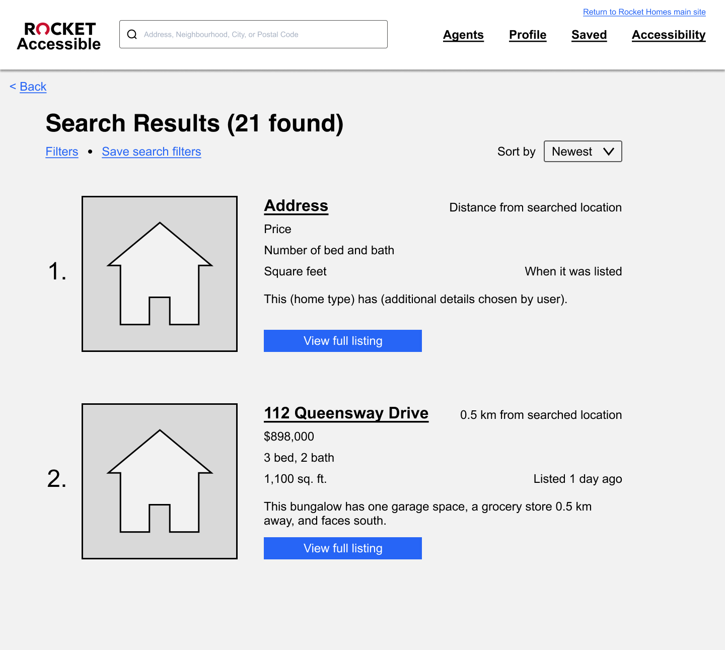
Each individual listing contains information about the home’s address, price, number of bedrooms and bathrooms, square feet, and when the listing was posted. This is information that currently exists on the listing cards in Rocket Homes, but has been reorganized based on user feedback.
We also added a short summary of the house that relates to filters the user selected. The short summary helps provide further information relevant to the user to help them quickly browse the listings and decide which ones to further explore. For example the second listing here has the description “This bungalow has one garage space, a grocery store 0.5 km away, and faces south” as the user expressed these preferences when filtering.
We also included a distance from searched location as users expressed in our research the importance of being close to certain locations since many of them rely on walking or public transportation as they cannot drive.
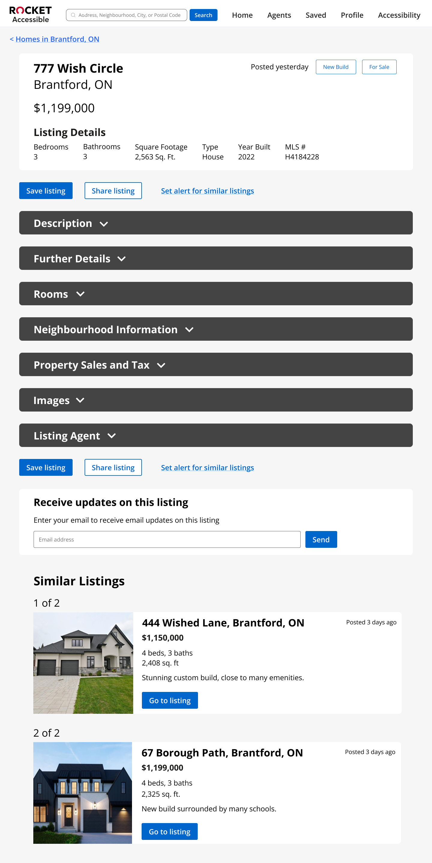
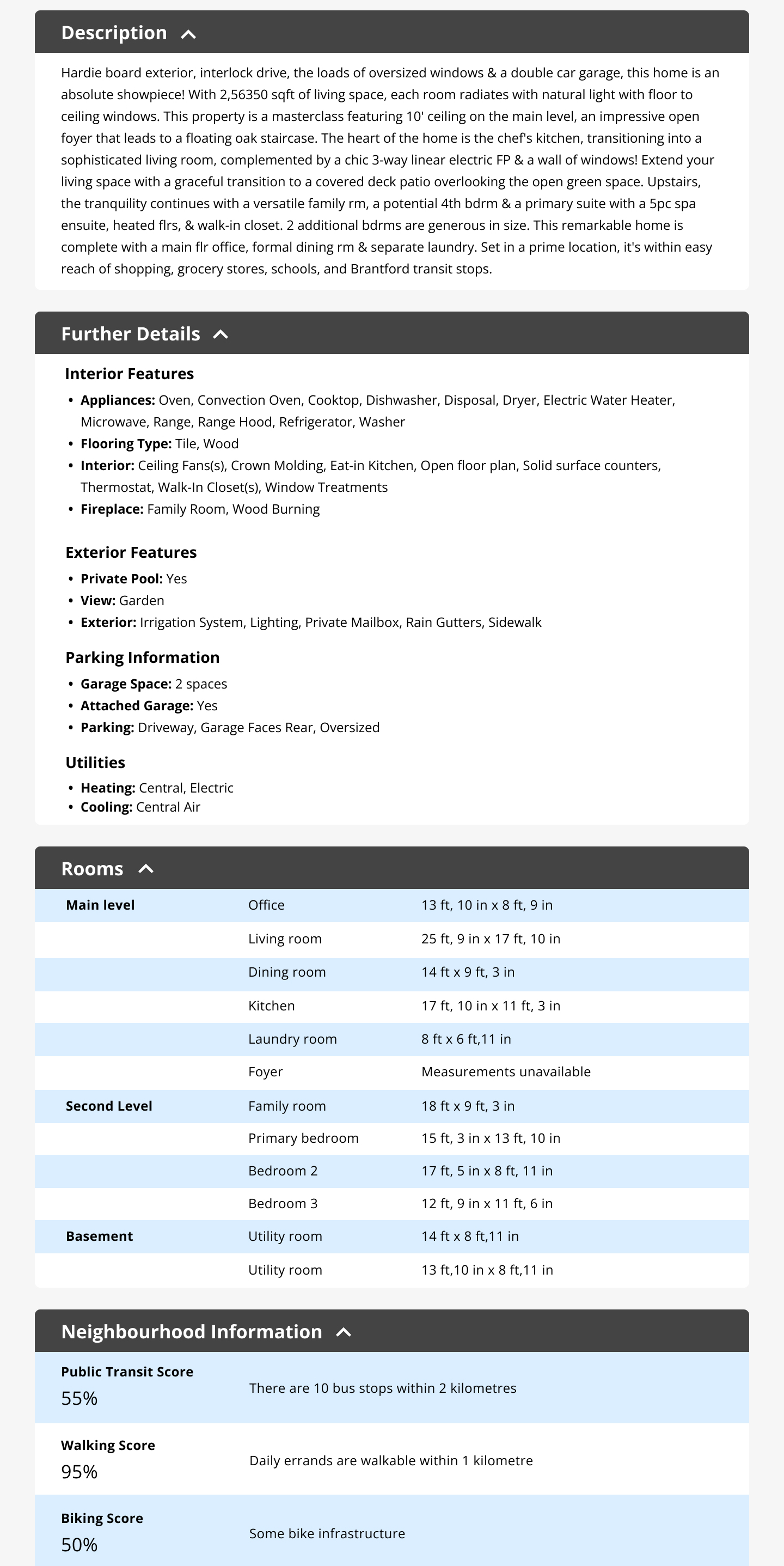
If the user selects the “View full listing” button, they will be brought to the page with the full listing details. The order of the content on this page was determined through our interviews. Details like price, address, square feet, house type, and the number of bedrooms and bathrooms are at the top as this is what users said was the most important. Next is the home description which is important since users rely on a written description to learn about the home since they cannot see the house through the images. After that are Further Details of the house, but this is put under a dropdown. If all the details were available on the page, this would require the screen reader to have to navigate through a lot of content when they might just want to get to other parts of the page. The dropdowns provide headers that make it much faster to navigate through when using a screen reader.
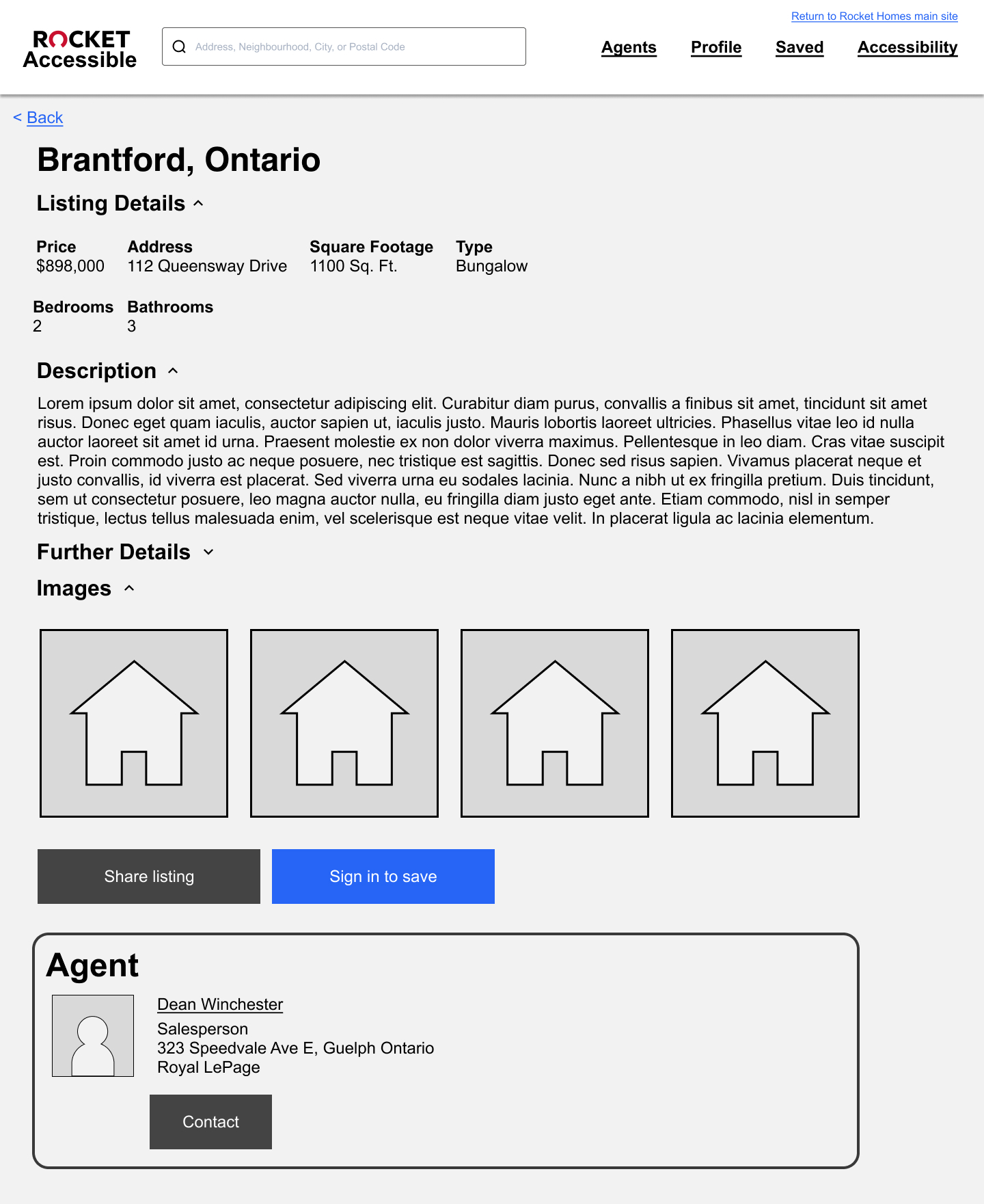
After the Further Details section are the home’s images which have alt text so the users can understand what is in each image. These images are located closer to the bottom of the page since our users expressed how they would only go through the images with alt text after becoming interested about the listing through reading the home’s description. Even though the user may not be able to see the image, many people in our interviews said that they explore home listings with someone who is sighted so having images there is still important.
Following that are options to share the listing or to save it to one’s account. Users wanted this near the bottom of the page since after going through the content above with their screen reader, they would be able to determine if the listing was worth sharing or saving.
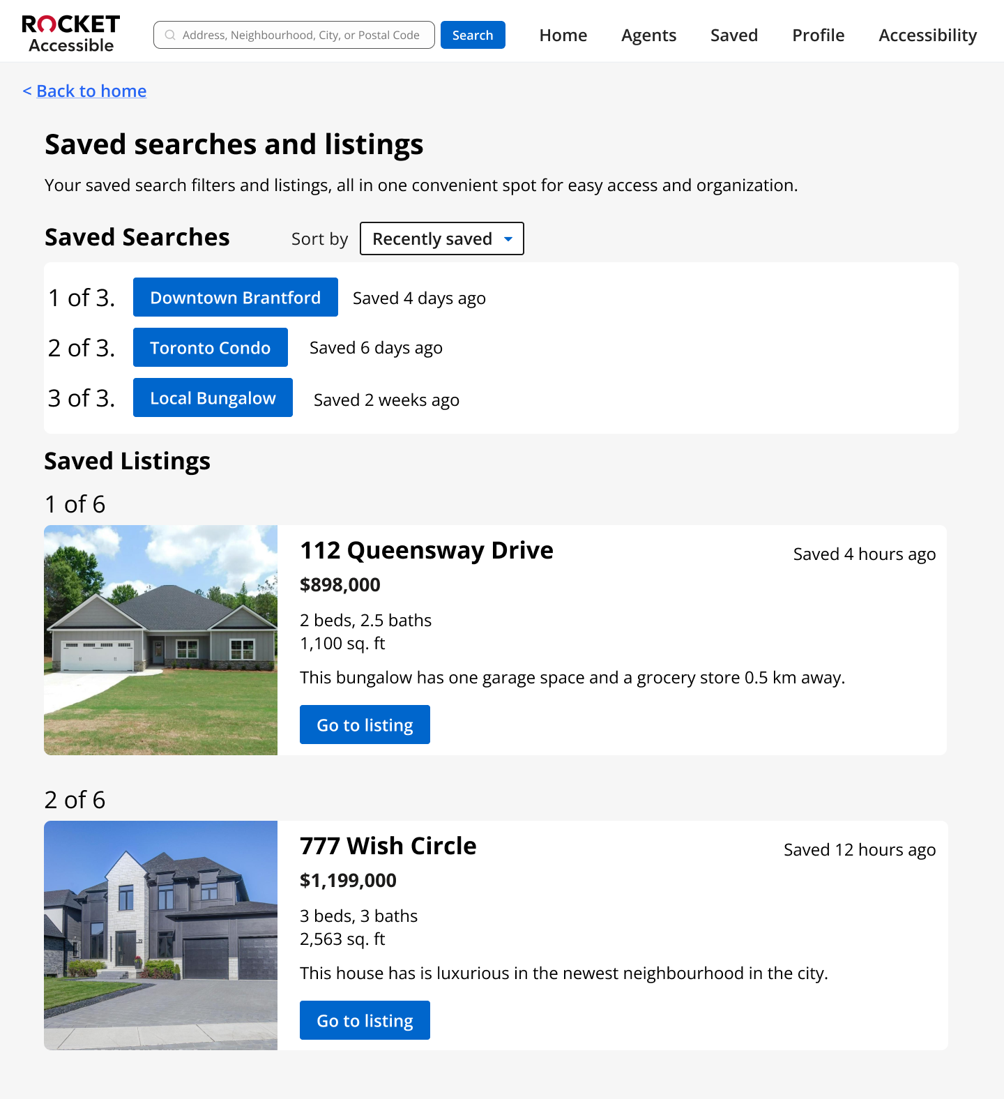
If users click on the save listing button, they will be brought to a Saved page which contains their saved listings in the same numbered list format that appears on the Search Results page to support screen reader navigation. Users can also find their saved searches here as well.
For our usability testing, we established a scenario where the participant was looking for a new home in an area of their choice but with a specific budget and number of bedrooms in mind. We asked participants to complete the following tasks in the Webflow version of our prototype while sharing their thoughts out loud:
We tested the prototype with 5 people who had a visually impairment and were familiar with using screen readers to navigate real estate websites. The feedback we received from our usability testing was positive.
Participants also gave us feedback on areas where the prototype could be improved.
My team and I used this feedback to improve the prototype, which we tested again. After this second round of usability testing, we made some more minor edits.
Our goal for the first two versions of the prototype was to focus on making our prototype work with screen readers and having all the most essential features users would need when searching for homes. After confirming that the prototype worked well, we improved the visual design, in addition to making improvements to problems found in usability testing. The following images show the updated prototype after two rounds of usability testing were completed.
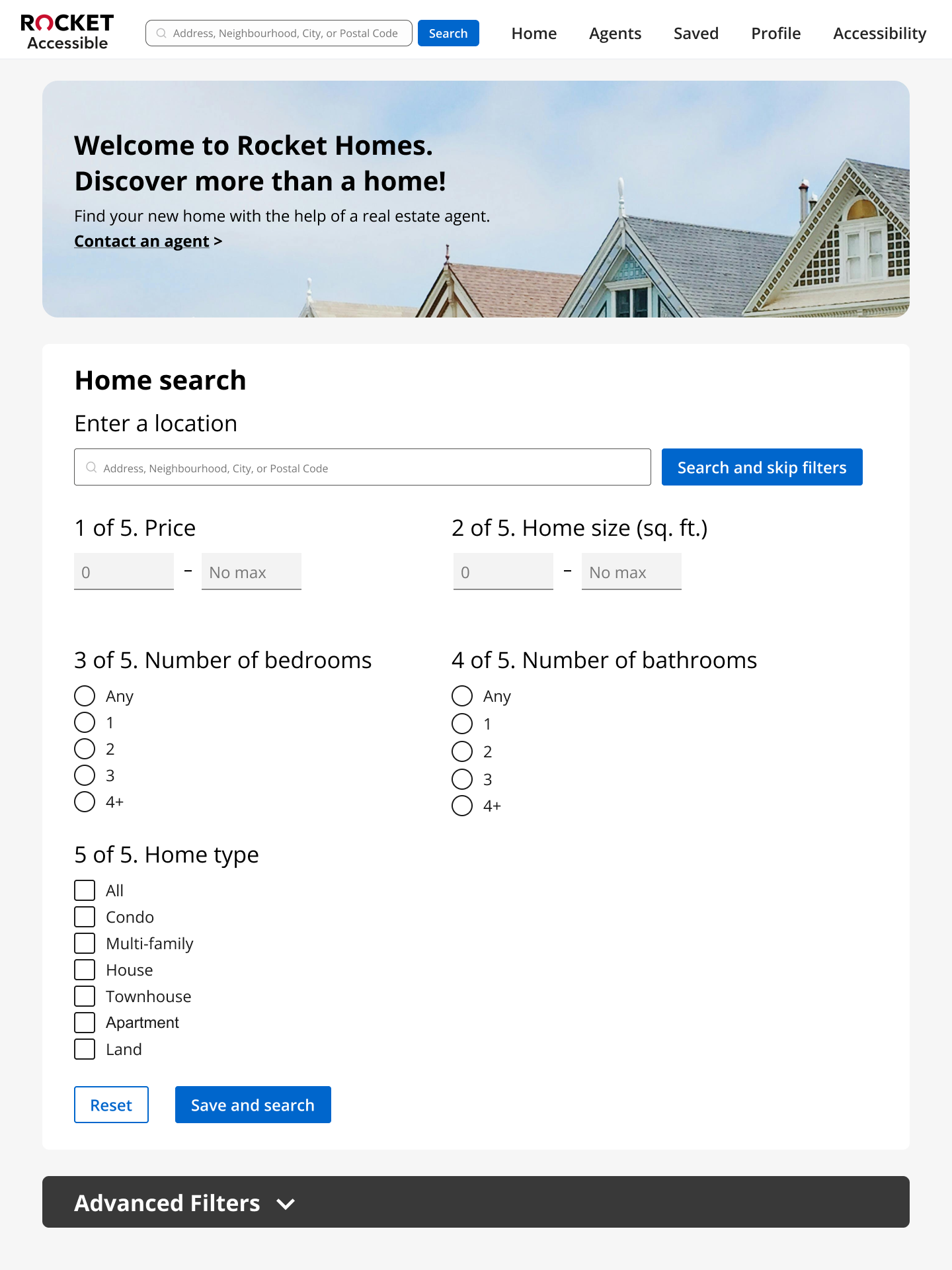
At the top of the landing page is a banner with a link for the user to fill out a form so that they can be paired with an agent. This was placed at the top due to the business needs of Rocket Homes and how many of our research participants stated that they valued having a real estate agent to help them with their home searching journey.
Below the banner, users can quickly search for a home by entering a location, or they can add additional filters to their search through filling in the 5 filters related to what users thought were the most essential filters.
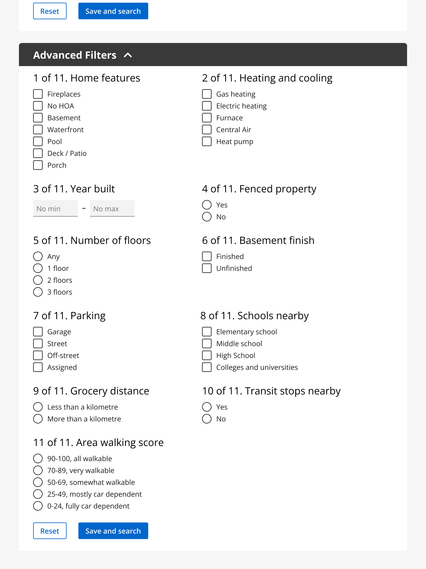
Below these 5 filters, users can find 11 additional filters located under the Advanced Filters dropdown. All headings for filters are numbered so that the screen reader can read out the number to let users know how many filters there are in the section. The majority of the filters use radio buttons or checkboxes which when detected by the screen reader, allows the user to know if they should select one option or if they can choose multiple. The filters that are available are based on what users expressed they needed during our interviews and have been organized based on their preferences.
For this page, we kept it quite similar to the first prototype as not much change was needed after testing. The main change was including the total number of items in the list when numbering each search result and changing the words on the button that leads the user to the full listing. Previously, it was "View full listing", but we changed it to "Go to listing" to make our choice of words relevant to our target users.
Feedback about using dropdowns for the many headers on this page was positive during usability testing. The first prototype did not contain all the information that a listing provides, but we added the missing information in the second prototype. These images from the latest prototype show what the default page looks like when it first loads, and what it looks like when some of the headings are expanded. Having these headings as expandable dropdowns allows for less content on the default page, which helps decrease the amount of time a user needs to complete their task on this page.
Besides improving the visual design and adding the total number of items in the list beside each number, not much was changed on this page compared to the first version of the prototype.
This project was the first project I worked on which focused on designing with users who have a visual impairment. It allowed me to gain a much better understanding of how they use computers and screen readers, which has helped me learn how to make my designs more accessible. I would like to end things off by sharing a quote that was said by one of the people who we interviewed for our user research about the importance of inclusive design.
"A well designed web page levels the playing field, whether you're approaching it with no disabilities or with a disability such as mine where I can't actually see the web page, but if it's designed well, I can access all the information just as well. Legally, pages in a web application or on a website need to be accessible, but I think it's just the right thing to make websites and web applications accessible."
To continue looking at my work, you can go back to the UX Design projects page or click the button below to see the project I worked on after this Rocket Homes Accessibility project. Thank you for reading my work!